Understanding the UI
The Enterprise Archive User Interface(UI) is divided into three main sections: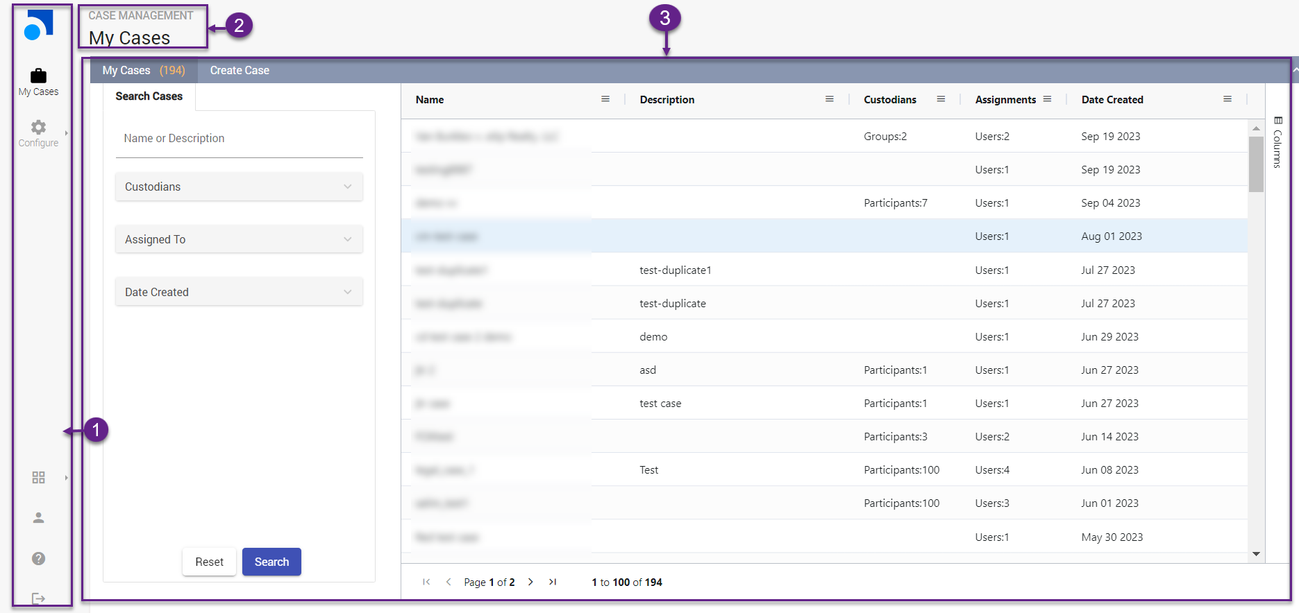 1. Left Panel
The Left Menu in Enterprise Archive allows users to view and enable certain user settings as well as access useful resources. The various menu options on the Left Panel are as follows:
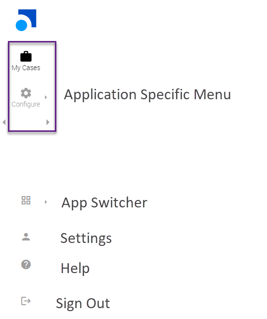
Application Specific Menu
This section
provides application-specific menu and configurations of individual applications. For example, if the user selects the Case Management App, the following options are displayed:
My Cases
Configure
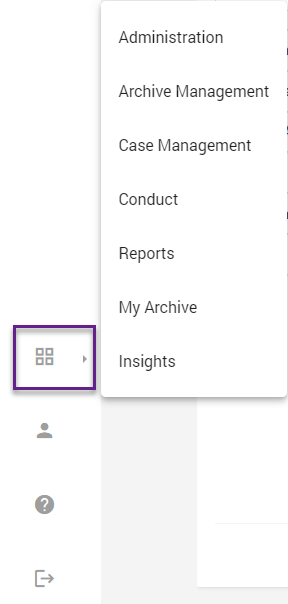
App Switcher
The App Switcher menu provides a list of all available applications within Enterprise Archive. It allows users to switch between different applications in Enterprise Archive.
Settings
Clicking on Settings displays the following options:
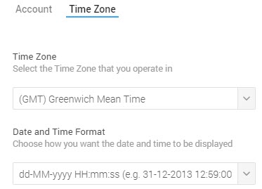
Account Settings - Select this option to modify account information and set a desired time zone as shown in the following image.
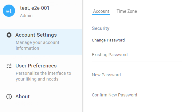
Important
The user preference for date and time format is with respect to the UI date and time fields only. However, the time zone that is selected will be considered during Exports.
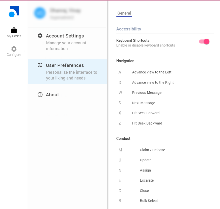
User Preferences - Select this option to view the list of available keyboard shortcuts to use the application as shown in the following image. The user can choose to enable/disable keyboard shortcuts for the application from this menu.
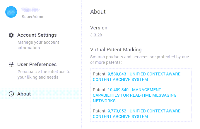
About: Click the About icon to view the version details and Enterprise Archive patent information as shown in the following image.
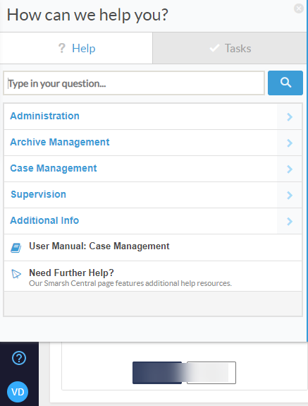
Help (?)
Click the help link to access the various help resources including interactive walkthroughs, online help and other useful links.
Sign Out
Select this option to sign out of the application, The user will be prompted with a confirmation message with a 5-second time-lapse.2. Top Header
The top header displays the selected application and the page within that application. It provides the user with information about their current location within the application's hierarchy or navigation structure, allowing users to quickly identify which application they are using or currently viewing.
For example, when a user selects the Tag Groups option from the Case Management >Configure menu to create a new tag group, the header is modified as follows: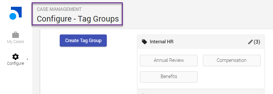
3. Content Panel
The Content Panel is the central area of the UI where the main content or primary functionality is displayed. This panel is responsible for presenting search results, selected application information, or any other relevant content that the user interacts with. It acts as the primary workspace for the user. The data table in the product's user interface presents search results with intuitive features that enhance your data interaction experience. Within the UI's content panel, you will find the data table that includes various capabilities, such as:
Search columns
This feature allows you to quickly locate specific data within the table by entering search terms. It simplifies the process of finding relevant information, especially in large datasets, making it more efficient for users.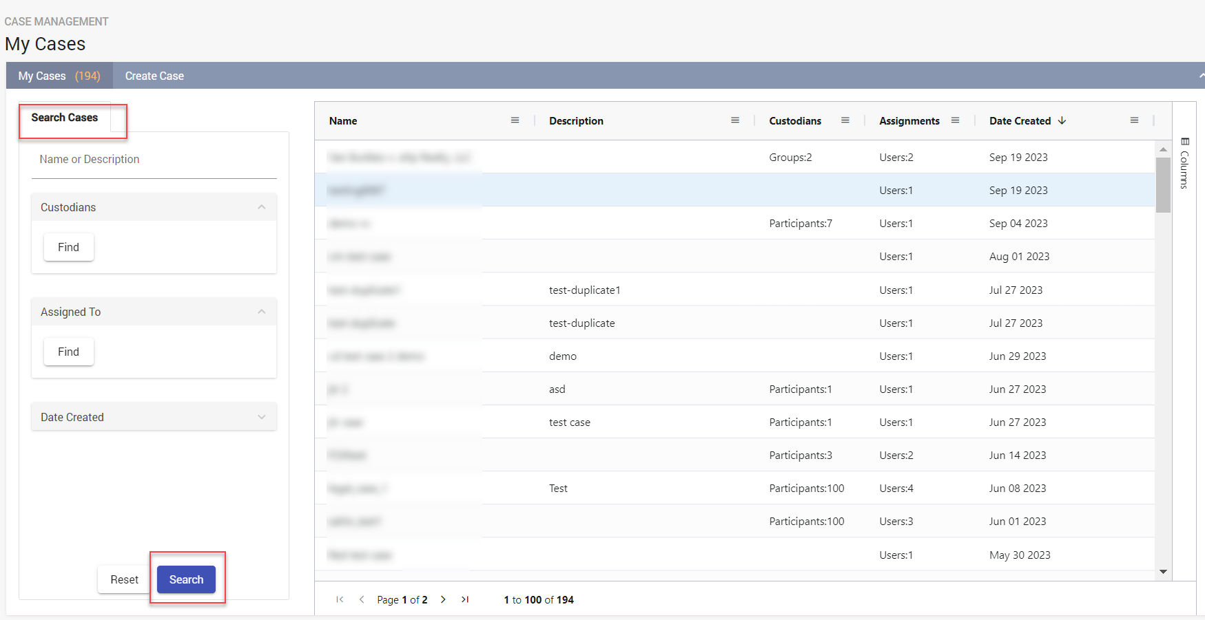
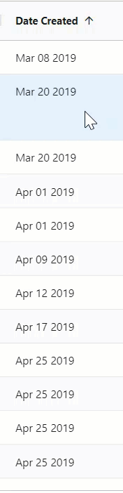
Sort columns
You can arrange the data in columns either in ascending or descending order. Sorting helps organize the information, making it easier to identify patterns or trends within the data.
Resize columns
This functionality enables you to customize the width of individual columns according to your
preference
. You can expand or shrink columns to accommodate the content within them, to improve readability.
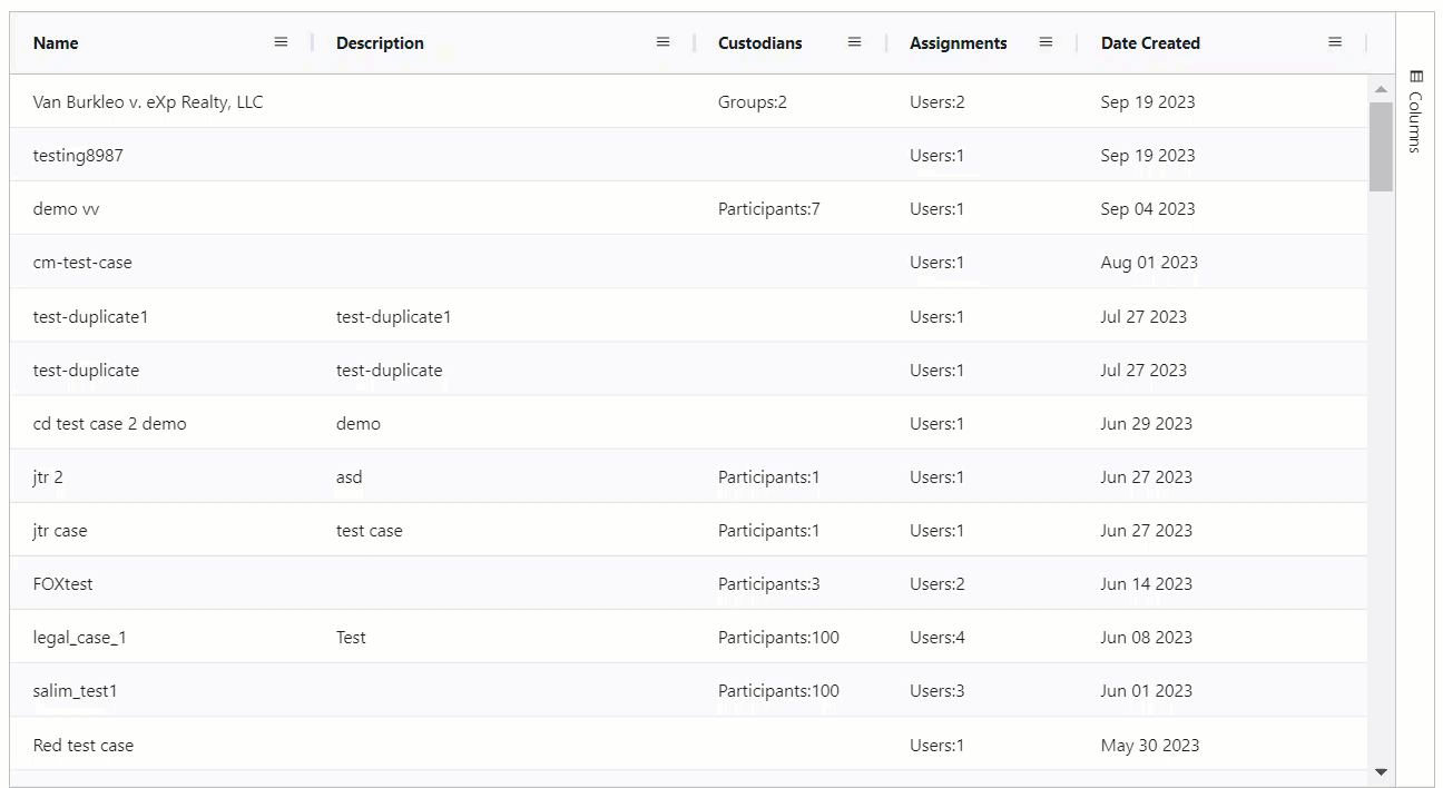
Pin columns
You have the option to "pin" important columns to the left or right side of the table. Pinned columns stay visible as you scroll horizontally, ensuring that important information remains easily accessible.
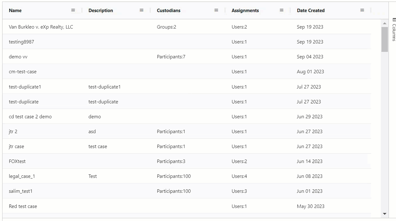
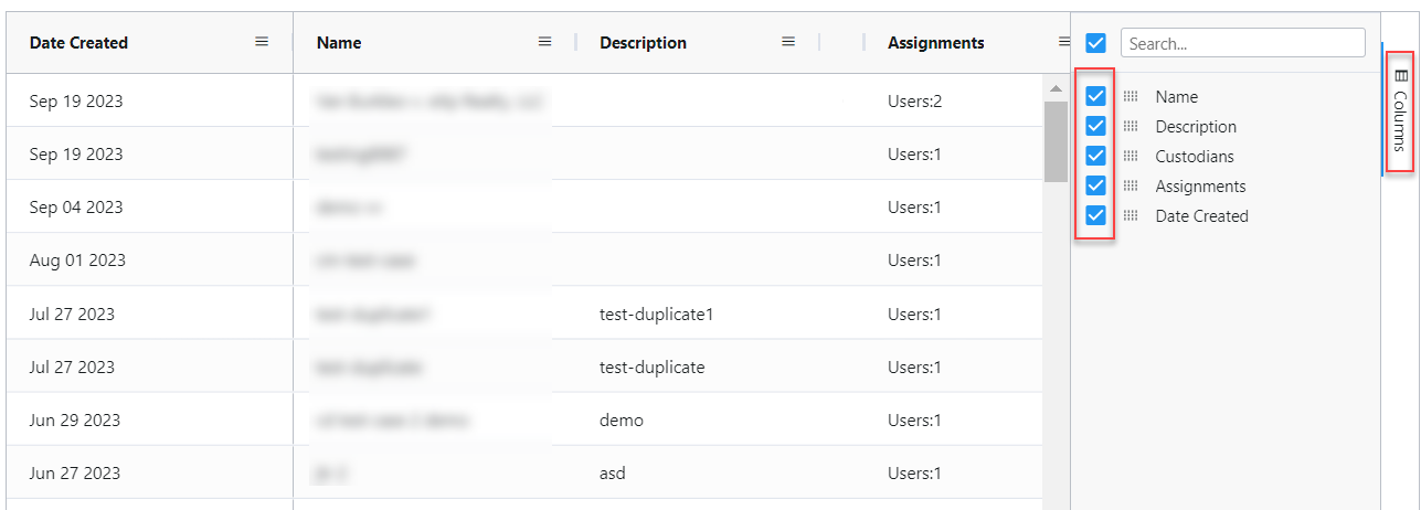
Column filter
This feature allows you to tailor the table's
columns
to your specific needs. You can choose which columns you want to see and hide those that are less relevant, providing a personalized and clutter-free user experience. By using column filters, you can refine your data based on specific criteria or conditions.